MOVING ONWARD...OR SHOULD I SAY MOVING IN ?
I showed you the preliminary renovation work on this home in February. If you missed it, check out the first post HERE! The client moved into their abode just a couple weeks before ‘shelter-in-place'“ began. What better time to enjoy the new home vibes than Quarantine 2020?
This blog is going to be like a mini HGTV session where you see the construction progress for some of the spaces. Beginning in the foyer (which used to be the dining room)….
The design starts…
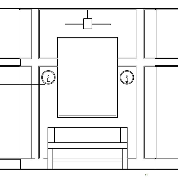
With concept images and sketches… we then produce technical drawings so the contractor can build our ideas. This drawing shows the layout of the paneling, placement of lighting, and the conceptual idea and scale for art and furniture placement.
Once construction is underway…
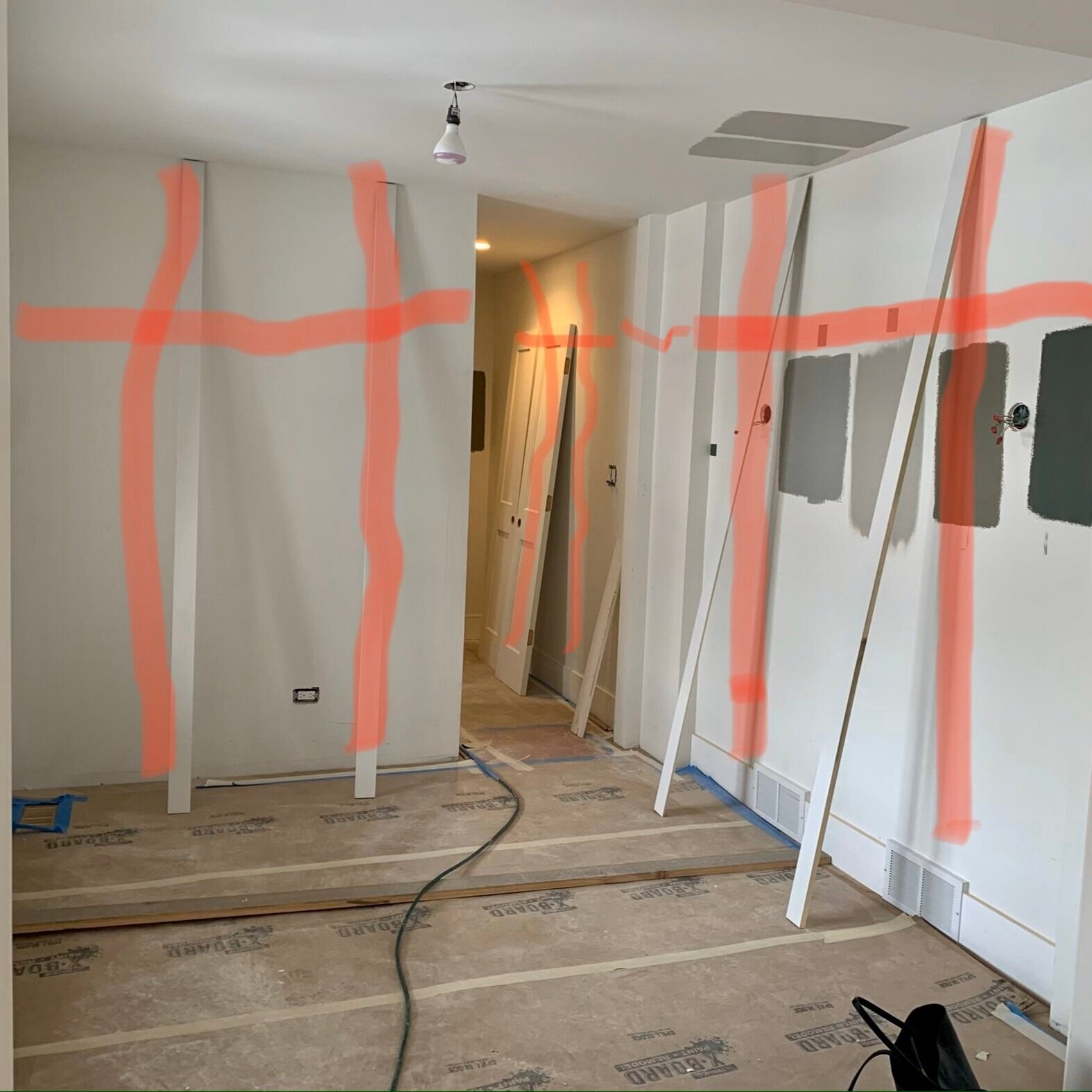
There are always on-site conditions that require tweaking. In the foyer there were some HVAC ducts that required the sconce location to move, which required the paneling to be adjusted. So, a few little panel placement studies (red lines on picture) and adjustments can be made. And, a few paint studies on the wall to determine which shade of grey.
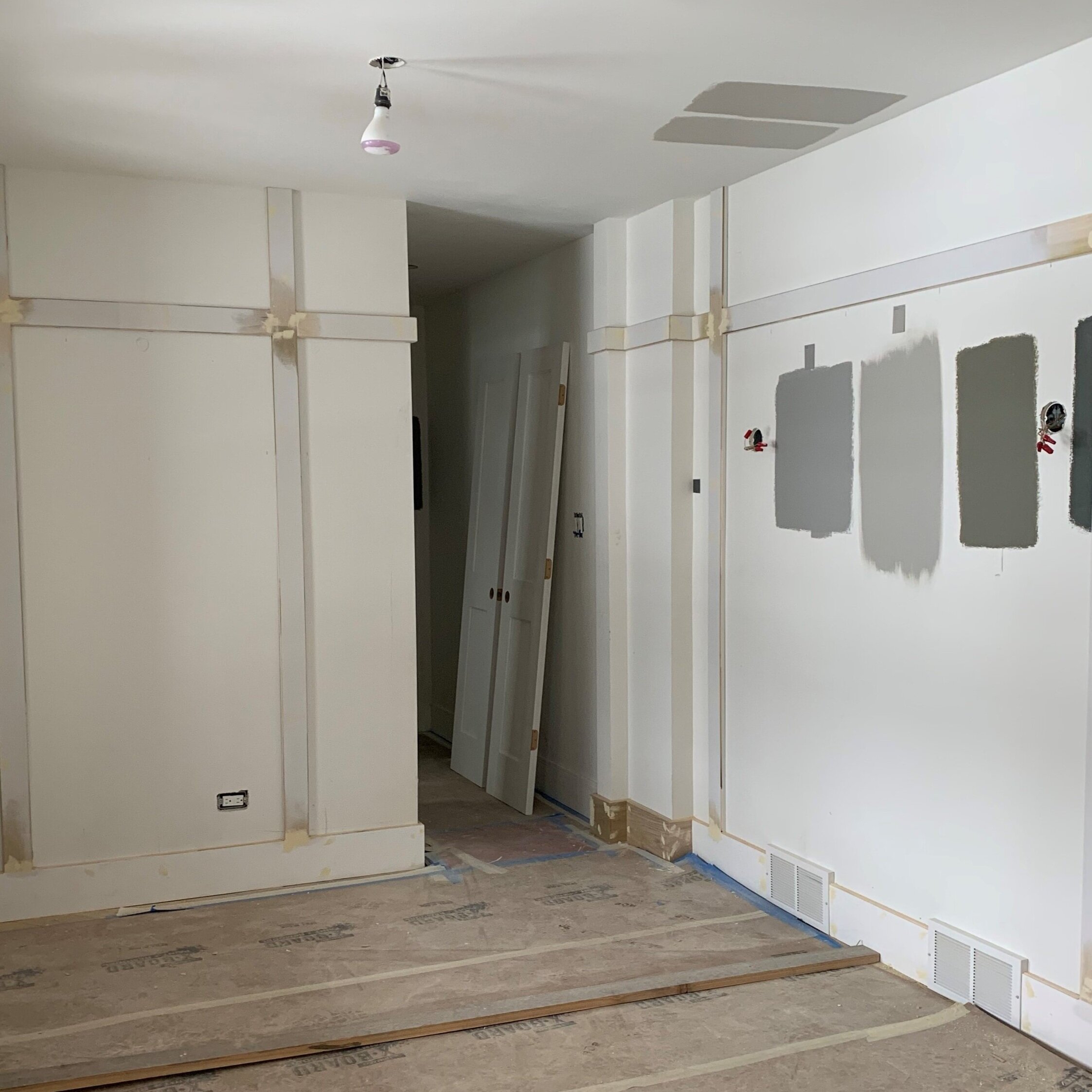
Panels installed!
Viola!
Sconces and ceiling pendant have been installed, and the console with black steel legs and faux shagreen top accented with a woven leather stool add varying textures and scale to the space. The foyer is just waiting on art, accessories for the console and vintage runner. And of course - the show stopper- the chevron floors, which make my heart skip a beat!
A video of the entrance!
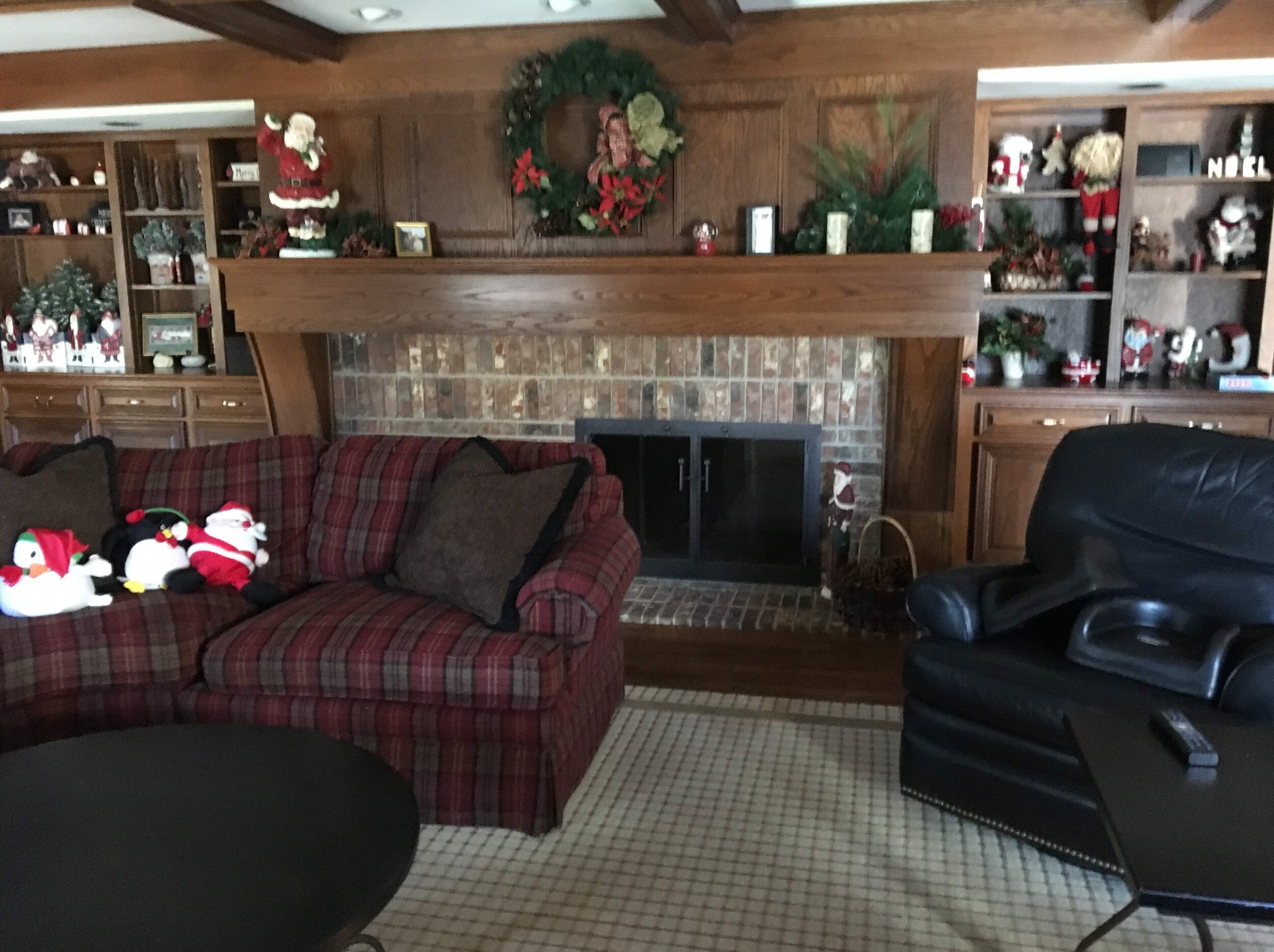
Continuing on to the fireplace in the family room. The existing firebox is offset within the structural wall. We were not able to modify this wall, which offered a fun challenge - how to create a compelling design using the asymmetry to your favor?
Before
back to the drawing board…
The drawing shows panel placement, a new mantel beam, stone fireplace surround, sconce and art placement.
Once everything is demolished…
I always like to double check my original design to make sure it not only looks good on paper, but that the scale and placement work in real life. Here I am taping out the paneling to confirm and revise proportions. This taping ‘hack’ also works well for assessing the size of rug that best suits your room as well as scale and placement of furniture and lighting.
The final product…
What a difference from the original, heavy fireplace. The asymmetry of this, which may have been seen as a negative, is actually what I love most about this wall. It creates a moment for something unique. The sconce on the left will highlight a piece of art below it which offers just enough to counter balance the fireplace.
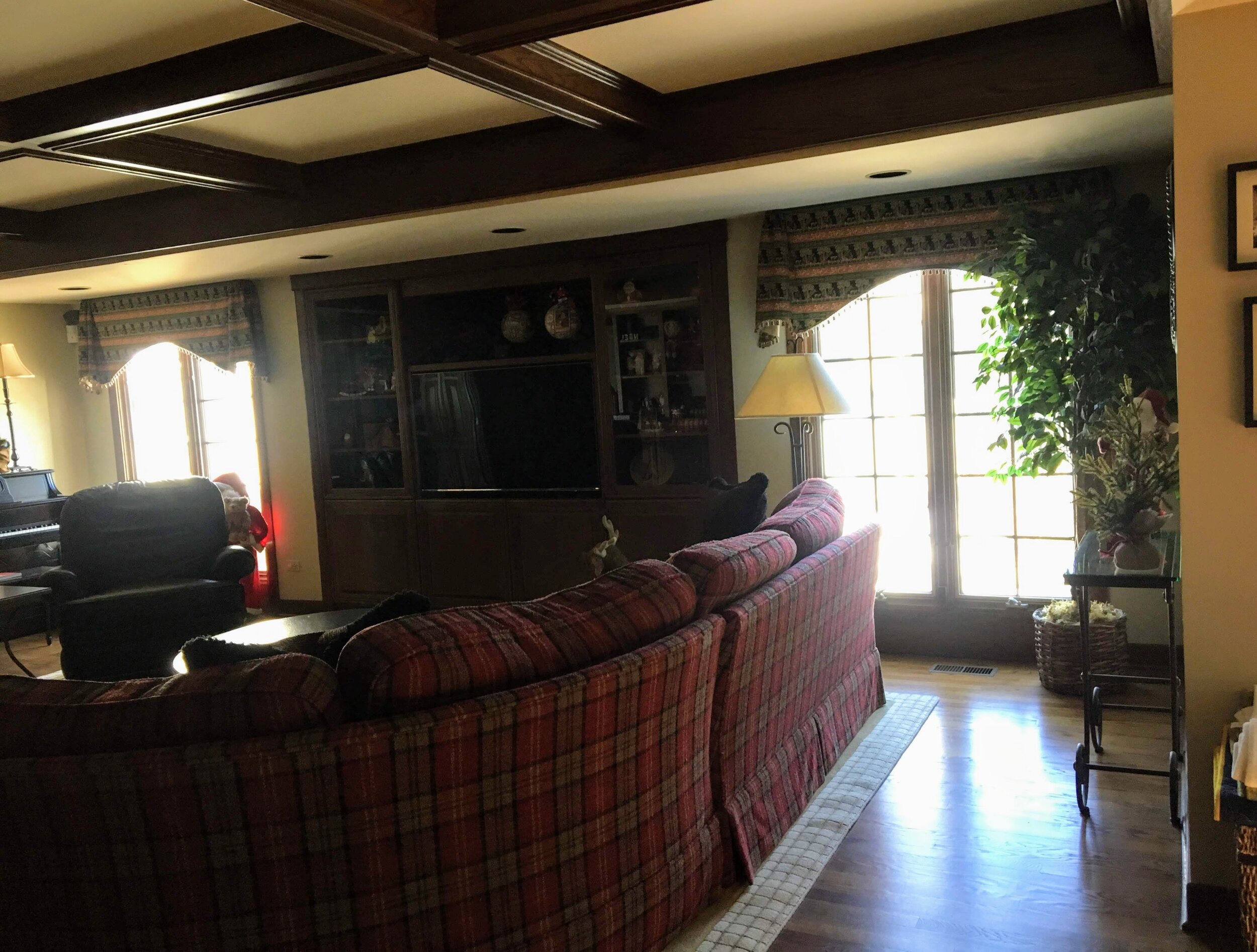
The wall behind the fireplace was previously the TV wall (see before picture). The architect wanted to get more light in the space. To do so he removed the existing built-in cabinet with TV and added a bank of windows.
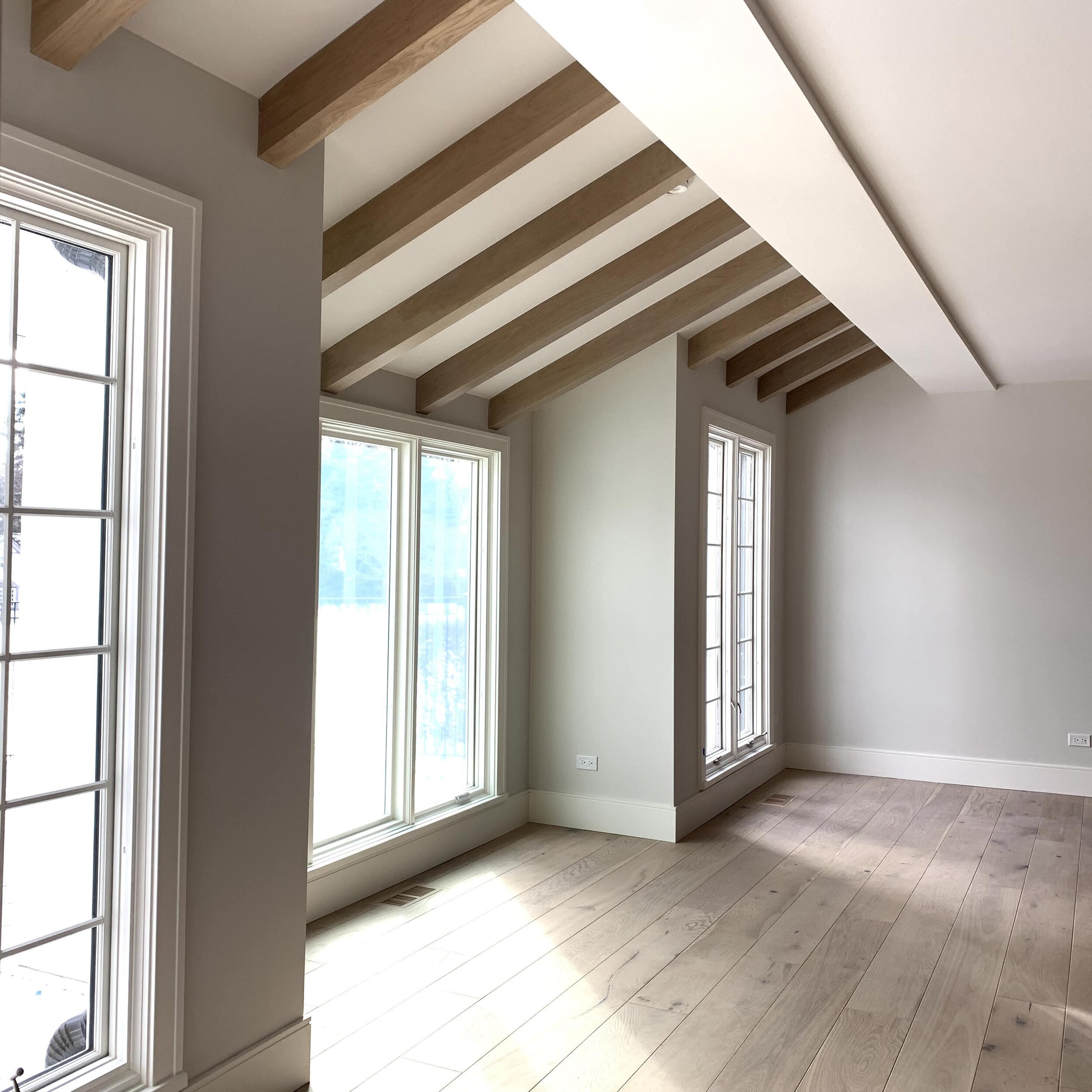
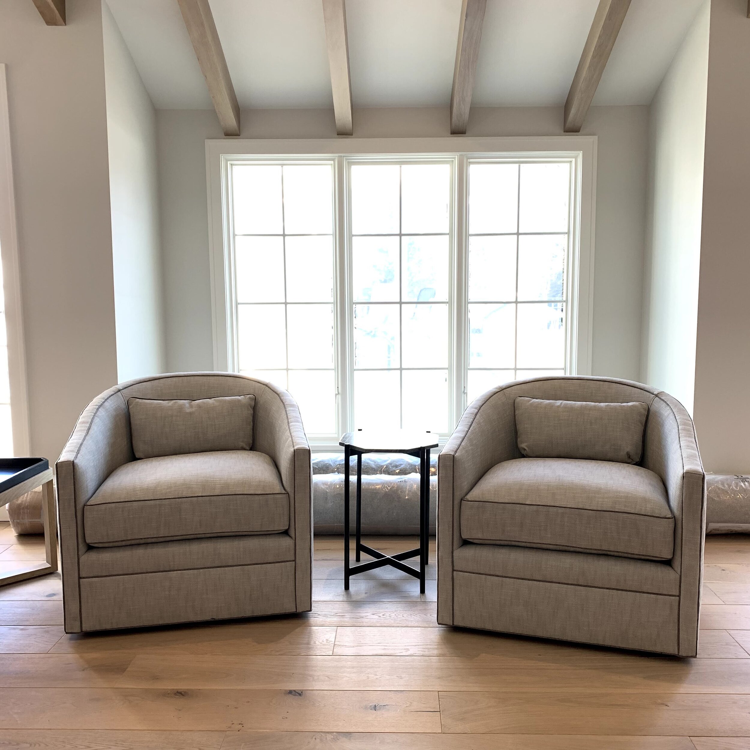
When the ceiling was removed, it revealed a small vaulted area which was previously covered by drywall. This presented another opportunity to use asymmetry to create a moment. We celebrated this change in ceiling planes by adding a few beams to draw your attention and create vertical interest. This small detail offers a compelling composition while defining an additional space and optically made the 8' ceilings feel a bit taller.
In the next blog post…
I will share the kitchen with you!! Now that’s a serious transformation!!

